# Load libraries
library(readr)
library(tidyr)
suppressPackageStartupMessages(library(dplyr))
library(ggplot2)
library(linearpackcircles)

# Data
DF = read_csv("https://raw.githubusercontent.com/owid/covid-19-data/master/public/data/owid-covid-data.csv", show_col_types = FALSE) %>%
  drop_na(total_cases_per_million, total_deaths_per_million) %>%
  filter(date == max(date)) # Keep only most recent data
Simple visualization
# Create Plot
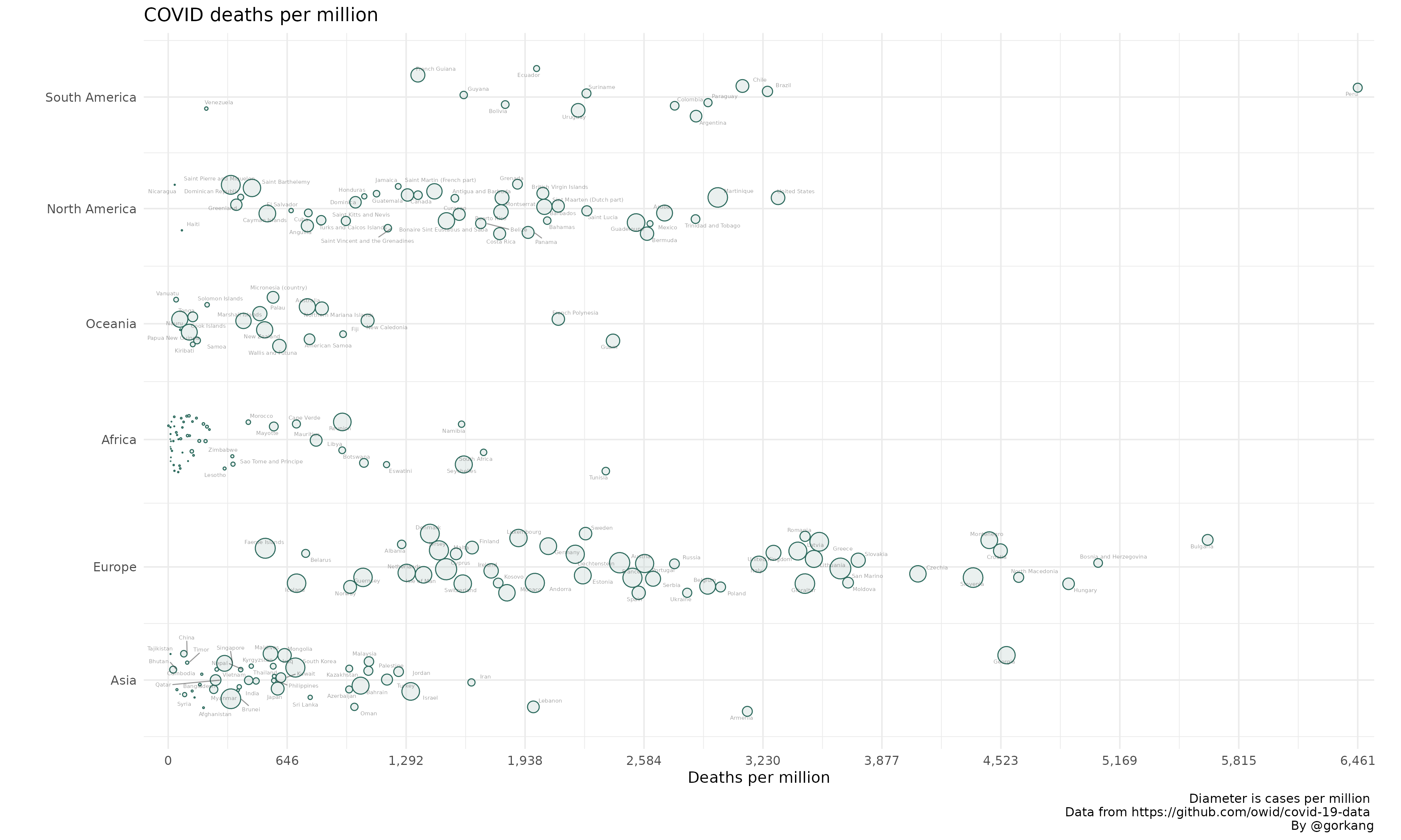
plot1 = linearpackcircles(DF,

                  ID_var = "location",
                  group_var = "continent",
                  area_var = "total_cases_per_million",
                  x_var = "total_deaths_per_million",

                  separation_factor = 200, # Separation between groups (i.e. continents)
                  width_plot = 2000, # width "units"
                  height_group = 100, # height within each group

                  label_circles = TRUE,
                  max_overlaps = 8,
                  size_text = 2,
                  area_multiplier = 1000)


# Add title, caption...
plot1 +
  labs(title = "COVID deaths per million",
       x = "Deaths per million",
       caption = "Diameter is cases per million \n Data from https://github.com/owid/covid-19-data \nBy @gorkang")
#> Warning: ggrepel: 48 unlabeled data points (too many overlaps). Consider
#> increasing max.overlaps
Highlight
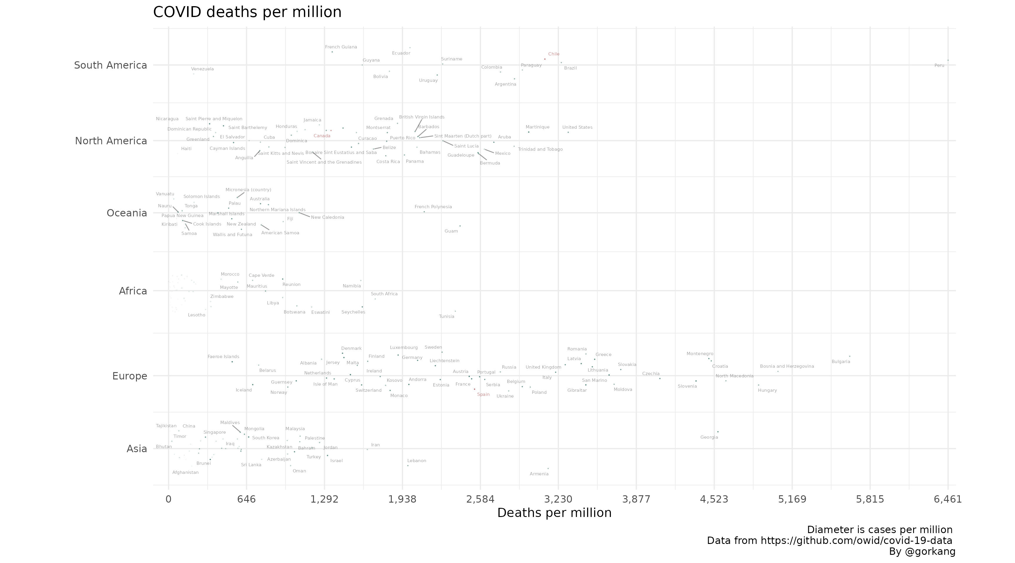
You can highlight any number of elements (i.e. counties).
# Create Plot
plot1 = linearpackcircles(DF,

                  ID_var = "location",
                  group_var = "continent",
                  area_var = "total_cases_per_million",
                  x_var = "total_deaths_per_million",

                  separation_factor = 200,
                  width_plot = 2000,
                  height_group = 100,

                  label_circles = TRUE,
                  max_overlaps = 8,
                  size_text = 2,

                  highlight_ID = c("Canada", "Chile", "Spain"))

# Add title, caption...
plot1 +
  labs(title = "COVID deaths per million",
       x = "Deaths per million",
       caption = "Diameter is cases per million \n Data from https://github.com/owid/covid-19-data \nBy @gorkang")
#> Warning: ggrepel: 67 unlabeled data points (too many overlaps). Consider
#> increasing max.overlaps