The goal of linearpackcircles is to create circle packing visualizations along a linear scale. It uses {packcircles} as a backend.
You can install the development version with remotes::install_github("gorkang/linearpackcircles"). Please report any problems you find in the Issues Github page.
Example plot
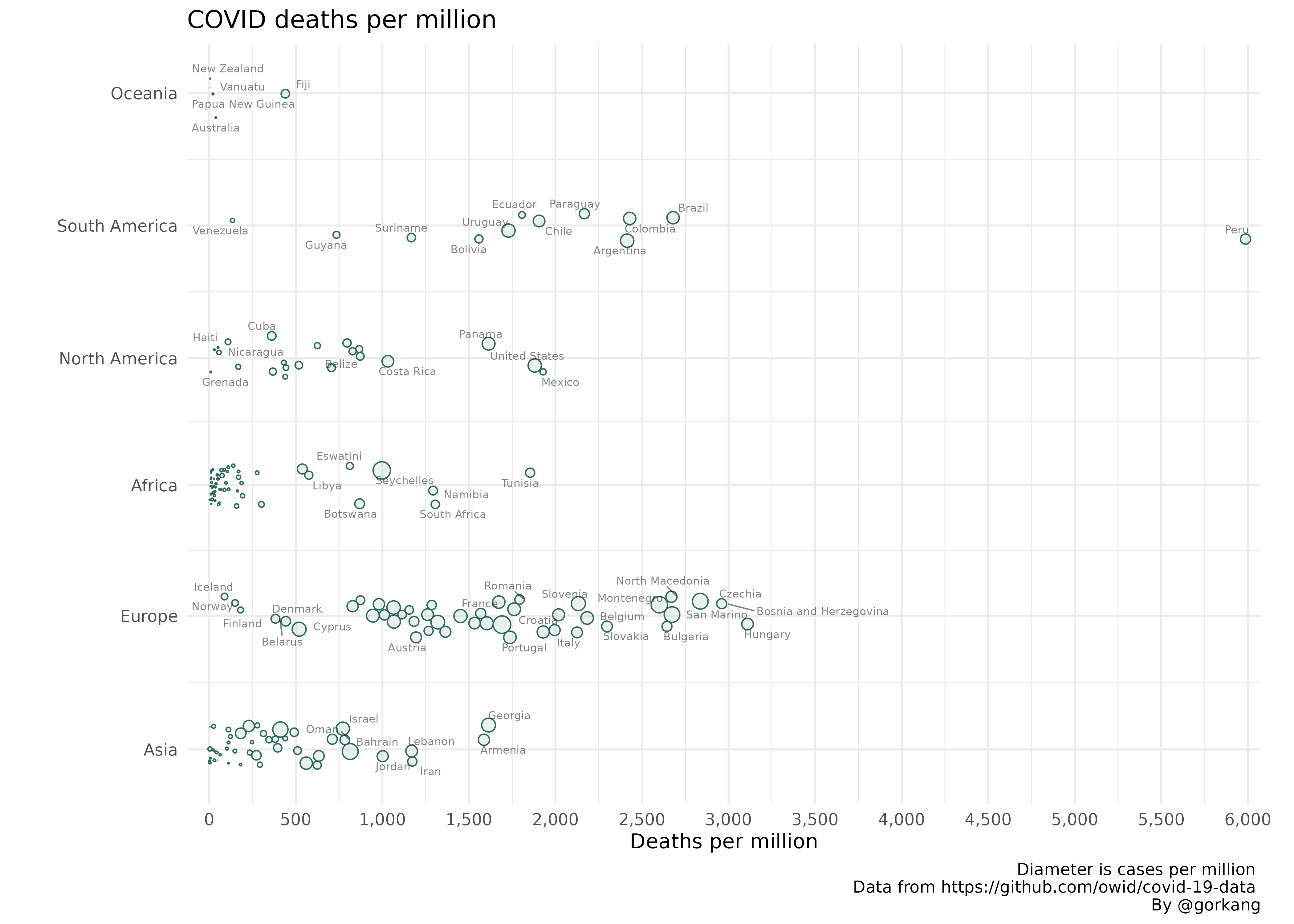
With the OWID dataset we can create a plot showing how total_deaths_per_million changes by continent and location (i.e. country), using total_cases_per_million for the circle diameter.
# remotes::install_github("gorkang/linearpackcircles")

# Libraries and functions
library(readr)
library(dplyr)
library(tidyr)
library(ggplot2)
library(linearpackcircles)

# Data
DF = read_csv("https://raw.githubusercontent.com/owid/covid-19-data/master/public/data/owid-covid-data.csv", show_col_types = FALSE) %>%
  drop_na(total_cases_per_million, total_deaths_per_million) %>%
  filter(date == max(date)) # Keep only most recent data

# Create Plot
plot1 = linearpackcircles(DF,

                  ID_var = "location",
                  group_var = "continent",
                  area_var = "total_cases_per_million",
                  x_var = "total_deaths_per_million",

                  separation_factor = 200,
                  width_plot = 2000,
                  height_group = 100,

                  label_circles = TRUE,
                  max_overlaps = 8,
                  size_text = 2,
                  area_multiplier = 1000)

# Add title, caption...
plot1 +
  labs(title = "COVID deaths per million",
       x = "Deaths per million",
       caption = "Diameter is cases per million \n
       Data from https://github.com/owid/covid-19-data \n
       By @gorkang")
